A time-to-value dashboard can make the problem look cleaner than it is.
The chart says new users take four days to reach value. Last month it was three. Everyone agrees that is bad. Then the hard question shows up: which user is stuck, where are they stuck, and what should the product do differently while they are still in the flow?
Short answer: time to value is useful only when it maps a stuck cohort to a missing value event, one product response, one guardrail, and a retention check. Otherwise it is just a stopwatch with anxiety attached.
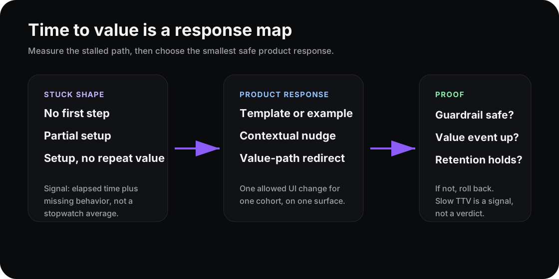
The metric says value is slow. The response map says what the product should try next.
Time to value is a path, not elapsed time
Amplitude defines time to value as the duration from signup or purchase to the first meaningful customer outcome. That last word matters. Outcome is not login, setup completion, or a tour view. A user reaches value when the product does the job they came for.
That is why Amplitude separates time to activation from time to value. Creating a project may be activation. Seeing that project solve a real workflow is value. Appcues makes the same onboarding point from another angle: long TTV creates churn risk because users may leave before the product proves itself.
So do not start by asking, “How do we make the average shorter?” Start with, “Which value event is late, for which cohort, on which path?”
Three slow-TTV shapes need different responses
A single average hides different product problems.
| Stuck shape | What it usually means | Better response |
|---|---|---|
| No first step | The user never found the first useful action | Show a template, sample data, or clearer empty state |
| Partial setup | The user started, then hit friction | Add contextual help at the failing step |
| Setup, no repeat value | The user completed chores but did not get a payoff | Route them toward the first repeat-value action |
Those are not interchangeable. If a team treats every slow user the same, it ships generic nudges. A checklist reminder goes to the user who needs a template. A product tour goes to the user who already completed setup. A sales nudge goes to the user who has not seen value yet.
That is how time-to-value work turns into more noise.
Measure the missing behavior
Mixpanel’s product analytics guidance puts time to first key action and activation milestones inside the broader behavior picture: funnels, retention, cohorts, and journeys. That is the right model. TTV is not a standalone metric. It is a relationship between a start event, a value event, and the behaviors between them.
Before changing onboarding, write this down:
| Field | Example |
|---|---|
| Cohort | Trial admins who signed up from integration pages |
| Missing value event | First live report shared with a teammate |
| Stall signal | Connected data source but did not publish report in 24 hours |
| Response | Replace generic dashboard empty state with a report template |
| Guardrail | No increase in setup exits or support tickets |
| Retention check | More users return in week two after publishing |
Now the metric has teeth. It tells the product where to respond.
Link TTV to retention, not just onboarding speed
Fast setup is not always good. Sometimes users skip setup because they are confused. Sometimes they move quickly because they are low intent and just clicking around. Sometimes the slow user is the one doing real work.
This is why activation metrics need a retention check. A shorter TTV only matters if it moves the behavior that predicts later retention. If the team cuts a setup step and more users reach the dashboard but fewer come back next week, the stopwatch improved and the product got worse.
PostHog’s onboarding drop-off guidance points teams toward the same discipline: find where users stall, then fix the path. The fix should be tied to a behavior, not to the existence of a metric.
Where Rayform fits
Rayform sits after the team trusts the signal. Your analytics stack can measure the start event, value event, stall behavior, cohort, and retention window. Rayform turns that signal into a controlled runtime UI response.
The goal is not to personalize every second of onboarding. Bad shape. The goal is smaller: when a known cohort is slow to a known value event, change one surface in one approved way, then keep it only if the guardrail stays safe.
Try this this week: pick one value event and write the response map before touching the onboarding flow. If you cannot name the stuck cohort, response, and guardrail, you do not have a time-to-value strategy yet. You have a slower chart.
See how Rayform turns behavioral signals into runtime UI changes.