An analytics dashboard can make a team feel aligned before it has actually decided anything.
Activation fell. Feature adoption is flat. Trial users are stuck in setup. Everyone can see the chart, which is useful. Then the meeting gets weirdly foggy: who owns the fix, which users should see it, and what should the product do differently tomorrow?
Short answer: a dashboard response map pairs each important metric with the cohort, surface, behavior, UI response, owner, guardrail, and review date. The dashboard spots the signal. The response map makes the next product move explicit.
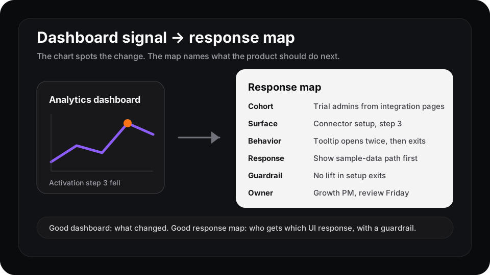
The chart names the change. The response map names the product decision.
Dashboards show the signal, not the response
Contentsquare’s dashboard guide describes product analytics dashboards as a hub for what is happening in the product: who signs up, which features get used, where users churn, and how people move through flows. It also says dashboards still leave teams asking why something changed unless they connect the data to user behavior.
That is the gap. A dashboard can say setup completion dropped. It cannot decide whether the next move is a better empty state, a template, a shorter path, a support prompt, or a delayed sales assist.
Amplitude’s product KPI dashboard template tracks DAU, conversion, engagement, session length, retention, and resurrection. Mixpanel’s dashboard writing emphasizes organizing and sharing product metrics so teams can investigate faster. All of that is good.
But faster investigation is still not a product response.
The response map fields
Use a small table beside the dashboard. Keep it boring enough that people actually fill it in.
| Field | What to write |
|---|---|
| Metric | The dashboard signal that moved |
| Cohort | The affected user segment |
| Surface | The exact page, step, or component |
| Behavior | What users did before the metric moved |
| Response | The one UI change you are willing to try |
| Owner | The person who can approve and remove it |
| Guardrail | The metric that stops a bad local win |
| Review date | When the response gets kept, changed, or removed |
The important part is the constraint. One cohort. One surface. One response. One guardrail. If the row needs a paragraph of exceptions, the team is not ready to ship a runtime change yet.
Example: onboarding drop-off
A dashboard says trial admins from integration pages are dropping at connector setup.
A weak response is “improve onboarding.” That becomes a backlog item with no shape.
A better response map looks like this:
| Field | Example |
|---|---|
| Metric | Connector setup completion fell |
| Cohort | Trial admins from integration pages |
| Surface | Connector setup, step three |
| Behavior | Opens tooltip twice, idles, exits |
| Response | Show sample data path before connector setup |
| Owner | Growth PM plus integrations engineer |
| Guardrail | No increase in setup exits or support tickets |
| Review date | Friday after 500 exposed users |
Now the dashboard has teeth. The product team can argue about a concrete response instead of debating a vague activation problem.
Example: feature adoption
The same model works after launch. Say the feature dashboard shows first-use is healthy but repeat use is weak.
Do not send every user a bigger announcement. Map the behavior first. Maybe power users try the feature once and never invite a teammate. Maybe new workspaces open the feature from the changelog but never hit the value event. Those are different rows.
That is why feature discovery is not the same as feature adoption. Discovery can be solved with visibility. Adoption usually needs the product to respond at the moment the user stalls.
Where Rayform fits
Rayform sits after the team trusts the signal. Your analytics stack keeps measuring events, funnels, cohorts, and retention. The response map decides which behavior is safe enough to act on.
Rayform can then turn that map into a controlled runtime UI response: this cohort, on this surface, after this behavior, sees this approved change. The dashboard keeps measuring whether the response worked.
Try this before adding another chart: pick one dashboard metric that moved this week and write one response-map row. If you cannot name the owner, UI response, and guardrail, the dashboard is not actionable yet. It is only visible.
See how Rayform turns behavioral signals into runtime UI changes.