Thursday afternoon. The launch Slack thread is still warm, the changelog email went out, and the new feature has a nice first-week spike. Then the chart flattens.
Nine percent of active users opened it. Two percent used it twice. Almost nobody reached the value moment you built the whole thing for.
That is the feature adoption dead zone. The team proved users could discover the feature, but not that the feature became part of their workflow.
Feature discovery vs feature adoption
Feature discovery means a user noticed the feature or tried it once. Feature adoption means the right user repeats the action that creates value.
Those are different jobs.
Amplitude’s feature adoption report makes this visible in the questions it asks: what percent of active users did the event, what percent did it for the first time, how often each user did it, and how many returned after first use. The return question is the one teams skip. It is also the one that separates launch curiosity from adoption.
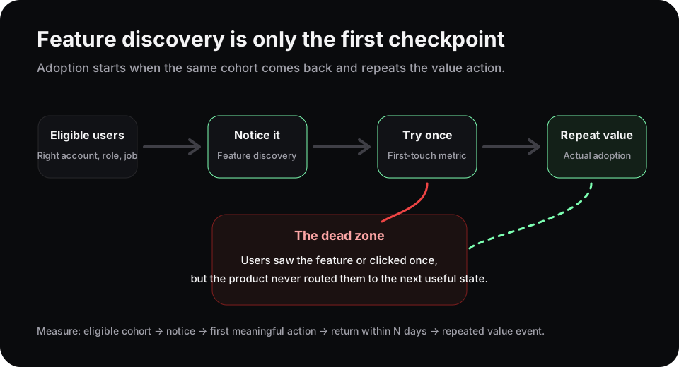
The dead zone sits after first touch. Users saw the feature, but the product did not route them to a useful next state.
Why first use lies
First use is a noisy metric. A user can click because the feature is new, because a modal forced them there, because a PM put a badge on it, or because they are lost.
That click does not tell you whether the feature matched their job.
A healthier read separates four states:
| State | What happened | What to check next |
|---|---|---|
| Not eligible | The user does not have the job or permission | Account role, plan, workspace maturity |
| Not discovered | The right user never saw it | Entry point, navigation, empty state, timing |
| Tried once | The user clicked but did not finish | Friction, comprehension, missing data, trust |
| Adopted | The user returned and repeated the value action | Retention, expansion, downstream workflow |
Most teams over-invest in the second row. They add banners, tooltips, launch emails, and “new” badges. That can lift discovery. It rarely fixes the third row.
The third row is where the product has to adapt.
The instrumentation that matters
Start with one feature, not a portfolio review.
Define three events:
- Exposure: the user had a real chance to notice the feature.
- First value action: the user completed the smallest action that proves the feature did something useful.
- Repeat value action: the user came back and did it again within a meaningful window, usually 7, 14, or 30 days depending on the workflow.
Then compare the event windows around users who reached repeat value against users who stopped after first use. Look for the behavior right before the dead zone: repeated tooltip opens, backtracks, rage clicks, empty-state exits, permission errors, or long idle time.
PostHog feature flags, Amplitude cohorts, Mixpanel funnels, and Segment traits can all help you describe the cohort. The important part is not the tool. It is the sentence you can write after looking at the data:
“Admins from teams under 20 people try the automation builder once, hit an empty state, and never create the first rule.”
That sentence points to a product response. A global announcement does not.
Route the next state, not another reminder
Once you name the dead-zone behavior, choose one UI response.
If users are not eligible, hide the feature or explain the prerequisite. If they never discovered it, move the entry point closer to the job they already perform. If they tried once and stalled, show an example, import a sample, delay the prompt, or route them to a smaller first action. If they adopted, stop interrupting them and measure whether the feature changes retention or expansion.
This is why the market keeps pulling analytics, feature flags, and experimentation into the same workflow. Statsig talks about build, ship, measure, learn. PostHog puts flags near product analytics. Mixpanel frames product adoption as an ongoing measurement problem. Teams do not just want another report. They want the shortest path from behavior to product response.
Rayform sits in that last mile. It reads behavioral telemetry from stacks like PostHog, Segment, Amplitude, and Mixpanel, then adapts the UI at runtime for the cohort showing a specific pattern. The dashboard still measures the result. The product handles the next state.
Try this this week
Pick one feature with weak repeat use. Ignore the launch spike.
Write these four numbers on one page: eligible users, first exposure, first value action, repeat value action. Then choose the biggest drop and name the behavior behind it.
If the answer is “users saw it but did not come back,” do not send another announcement. Change what those users see next.
See how Rayform turns behavioral signals into runtime UI changes.