A cohort chart can be brutally useful. It shows the week users stop coming back, the plan that expands, the signup source that looked cheap until month two.
But the chart is still only a report.
The strategy starts when someone can answer three questions: which cohort is in trouble, where in the product the pattern shows up, and what should change for the next user in that state.
Mixpanel defines cohort analysis as tracking a group of users over time to understand conversion, engagement, and retention. Amplitude’s SaaS cohort analysis guidance makes the same point with product examples: group users by signup date, acquisition source, or behavior, then compare outcomes. Stripe’s SaaS cohort guide is blunt about why this matters: averages can hide the real story.
That is the value. The trap is treating the curve as the work.
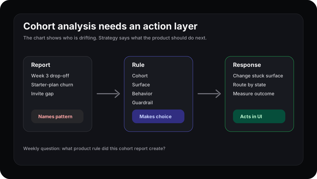
The report names the cohort. The strategy changes the product for the next user who matches it.
Cohort analysis tells you when, not what next
A retention cohort is good at timing. If users from the March signup cohort fall off in week three, you know where to look. If teams on the starter plan keep usage but stop inviting teammates, you have a sharper question than “why is retention down?”
That is progress. It is not a fix.
The report usually stops at the same place every week: week-three retention is soft, activation is weaker for one segment, expansion is better after a certain behavior. Then the team writes a ticket, opens a doc, or schedules another readout.
This is the same gap behind product analytics dashboards. Visibility improved. The product did not.
The missing layer is cohort state
A cohort becomes useful when it is no longer just a row in a table. It needs to become state the product can recognize.
For example:
| Cohort finding | Product state | Possible response |
|---|---|---|
| New teams drop in week three | Admin created project but never invited a teammate | Put collaboration setup inside the active workflow |
| Trial users retain after first report | User connected data but has no saved view | Route the empty state toward a first saved view |
| Starter accounts churn after hitting limits | Account hit limit twice in seven days | Explain the relevant plan at the blocked action |
This keeps the discussion out of vague territory. “Week-three retention is down” becomes “admins who created one project but invited nobody should see collaboration setup before the dashboard home.”
That sentence has a cohort, a surface, a behavior, and a response. Now the team can judge it.
Do not skip causation
Cohorts show correlation. They do not prove cause.
Amplitude’s retention cohort writing calls this out: users who perform a behavior may retain because the behavior helped, or because already-engaged users were more likely to do it. Both can be true. The practical move is not to overfit the chart. It is to form a small hypothesis and test the response.
If users who invite teammates retain better, do not immediately force every user into invites. Ask where the invite makes sense, which role should see it, and what guardrail proves you are helping instead of adding noise.
The guardrail matters. A cohort response should have a rollback condition, not just a hopeful metric.
Make the weekly cohort review produce one rule
Try a stricter weekly ritual.
Pick one cohort curve. Write one product rule:
“When this cohort shows this behavior on this surface, show this response, and measure this outcome.”
If the team cannot name the surface, the cohort is too abstract. If it cannot name the response, the report has not reached product strategy yet. If it cannot name the outcome, it is just personalization theater.
This connects directly to activation metrics that predict retention. A predictive early behavior is only useful if the product changes for users who have not reached it yet.
Where Rayform fits
Rayform’s angle is the last mile from cohort insight to interface response. Your analytics stack can keep doing the reporting. Rayform reads behavioral telemetry and adapts the UI at runtime for the cohort showing a specific pattern.
That does not make cohort analysis less important. It makes the chart actionable. The team still decides the rule, the guardrail, and the rollback. The product just stops waiting a sprint to answer a signal it already understands.
See how Rayform turns behavioral signals into runtime UI changes.