Wednesday morning. The growth team ships a new onboarding tour. Five tooltips, one modal, a pulsing beacon on the settings icon. Activation rate ticks up four points. The Slack channel celebrates.
Two weeks later the number is back where it started. The users who finished the tour did not reach value any faster. They just clicked through more screens.
This is the product tour trap. Teams add guidance because the product is confusing, measure completion because it is easy, and confuse the two. A tour that gets finished is not a flow that got fixed.
What tours are actually good at
Product tours, walkthroughs, and tooltips do a few jobs well. They announce new features to existing users. They explain UI changes after a redesign. They give a short-term boost when a known friction point has no engineering time scheduled yet.
In those cases the tour is a communication layer, not a product layer. It carries information the user needs without pretending the product itself has changed.
That distinction matters. A communication layer is temporary. A product layer is permanent. Mixing them up is how teams end up with five-year-old tooltips explaining a workflow that should have been rebuilt three sprints ago.
Why tours fail as fixes
There are four predictable failure modes.
Users skip them. The users who need the most help are often the fastest clickers. A forced tour creates compliance, not comprehension.
They add cognitive load. Every tooltip is one more thing to read while the user is trying to finish a task. The extra context competes with the primary goal instead of supporting it.
They do not change the underlying logic. If the import flow is confusing, explaining it with a tooltip does not make it less confusing. It makes the confusion annotated.
They go stale fast. Products change. Tours do not. A tooltip pointing to a moved button becomes noise, and outdated guidance is worse than no guidance.
The result is a layer of UI that looks like help but functions like a patch.
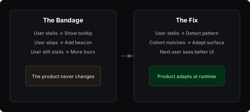
The bandage adds explanation on top of the product. The fix changes the product for the user.
The bandage pattern
The real pattern is organizational. When a team sees a drop in activation, the default response is often to add more explanation instead of asking why the product requires so much explanation.
This is the same gap that shows up in analytics dashboards. The product analytics dashboard tells you where users stall, but it does not ship the fix. A product tour is a similar kind of visibility without mechanism. It shows the user what to do next. It does not change what the product does next.
The onboarding checklist has a related problem: it measures completion, not value. Tours have a parallel problem: they measure exposure, not understanding.
What to do instead
Replace explanation with adaptation.
When a user stalls, do not show them a tooltip. Change the surface they are stuck on. If trial admins keep failing at CSV import, do not add a help beacon. Pre-load a sample CSV. If users skip the integration step, do not force a tour. Detect the skip and offer a one-click connect for the most common provider.
This is the four-step move from signal to product response:
- Surface. Where is the user getting stuck?
- Cohort. Which users hit the pattern?
- Behavior. What did they do right before the stall?
- Response. What should the product show next?
The response should live in the product, not on top of it.
Tours have a role
None of this means you should delete every tooltip. Tours are fine for announcements, temporary education, and known gaps waiting for engineering time. But they are not a substitute for product logic.
If your team keeps adding tours to fix onboarding, the real problem is probably not a lack of guidance. It is a product that waits too long to adapt to the user.
Rayform reads behavioral telemetry from your existing analytics stack and adapts UI at runtime. If a cohort shows the stall pattern, the next user in that cohort sees a different surface — no tour, no tooltip, no new sprint.